Mobile trends
October 10, 2025
Share


The most common mobile banner ad sizes in 2025
In 2025, most industries now invest more in mobile than in non-mobile digital advertising, with categories like telecom, retail, and media leading the charge. According to eMarketer, mobile is the clear majority of digital spend across the board, confirming what we already see in daily campaign planning: effective growth starts with ads that are designed for the mobile experience.
At the same time, media quality on mobile continues to improve. U.S. in-app display ads now reach an average viewability of 86.8%, a steady climb from just a couple of years ago. That means formats and placements are being designed in ways that are actually seen, and interacted with, by real users.
Why Banner Sizes Still Matter
It’s tempting to think banners are “just filler,” but for user acquisition, they’re still one of the most effective ways to create touchpoints without overwhelming the experience. Banner sizes determine how visible an ad is, how natural it feels in the flow of content, and ultimately, whether it converts. The challenge is balancing supply (publishers need fill), performance (advertisers need ROAS), and experience (users won’t tolerate clunky interruptions). This balance is closely tied to how ad inventory is bought and sold in real time. To see how that process shapes campaign efficiency, explore our post on Real-Time Bidding in Mobile App Advertising.
In 2025, the ecosystem has largely consolidated around a handful of proven sizes. Adaptive formats, SDK-optimized layouts, and smarter placement rules have taken what used to be a static asset and turned it into a dynamic performance lever.
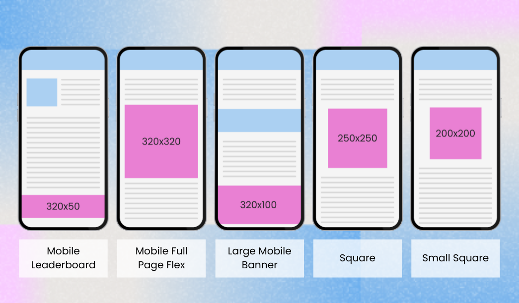
Top Performing Mobile Banner Ad Sizes for 2025
320×50, the mobile leaderboard, is still everywhere. It’s compact, reliable, and integrates cleanly at the top or bottom of the screen. That ubiquity is its strength: there’s massive supply, and it doesn’t disrupt the user flow. But its smaller height limits creative storytelling, so advertisers usually lean on it for visibility rather than persuasion.
A natural upgrade is 320×100, the large mobile banner. With twice the height, it offers clearer text, stronger calls to action, and better viewability scores. Publishers like it because it commands higher CPMs without breaking their layouts; advertisers like it because it drives better engagement at only a slight increase in footprint.
Then there’s the 300×250 medium rectangle. This unit has become something of a universal workhorse. It works equally well in feeds, within app content, or on mobile web placements. Its larger canvas allows for meaningful visuals and copy, making it a favorite for campaigns that need more than brand recognition (think product launches, retargeting, or app download pushes). Despite endless predictions of its decline, the 300×250 remains one of the most requested and filled sizes in programmatic auctions worldwide.
Publishers with roomier layouts sometimes use the 336×280 large rectangle, which delivers even more real estate for visuals and messaging. On the other end of the spectrum, ultra-compact sizes like 300×50 still fill gaps in interfaces where space is tight, though they often perform best when paired with larger formats to balance visibility with supply.
Outside the banner family, 320×480 interstitials still play a role in mobile monetization. While not technically “banners,” they compete for the same budgets and are often part of the same strategy. The key in 2025 is moderation: interstitials should be reserved for natural breaks in the user journey, with strict frequency caps to avoid churn.
Adaptive and Responsive
The biggest change in mobile banner ad strategy is the rise of adaptive banners. Instead of fixed heights, adaptive banners let the SDK determine the optimal size based on the user’s device. This flexibility means creatives are always rendered in a way that maximizes visibility, without breaking layouts or forcing awkward reflows.
Google’s AdMob and Ad Manager now actively recommend adaptive units as the default, and both iOS and Android publishers have embraced them. Campaigns that rely on adaptive placements consistently see higher CTRs and improved fill rates, because the system matches supply and demand more intelligently than fixed formats ever could. For advertisers, it means better reach and more consistent performance metrics; for publishers, it translates into stronger yields with less UX compromise.
Benchmarks and Market Signals
According to Pixalate’s Q1 2025 benchmarks, U.S. mobile in-app viewability is around 67%, while mobile web viewability sits closer to 59%. This steady improvement highlights how design and placement strategies are evolving to ensure ads are not only served but actually seen.
Spending patterns tell a similar story. Mobile advertising now represents the majority of digital ad budgets across industries, with some categories allocating well over 60% of their spend to mobile placements. For marketers, that means the competition for quality inventory has never been higher, and the margin for wasted impressions has never been smaller.
Quality, however, remains a challenge. Invalid traffic continues to be a concern, but campaigns that lean on adaptive placements and implement pre-bid fraud filters see significantly lower IVT rates than those relying on static, poorly integrated banners. In practice, that means the right mix of technology and placement strategy can make the difference between wasted spend and measurable return.
These benchmarks show that banners, when executed correctly, aren’t just filler inventory. They’re part of a performance strategy that spans acquisition, engagement, and retention.
Best Practices for Mobile Banner Advertising in 2025
In 2025, the smartest UA teams design legibility-first creative: three to five words of copy, a single visual hook, and a clear CTA. They deploy larger units like 320×100 in placements where they need impact, while letting 320×50 serve as consistent brand presence. In-feed placements typically run 300×250 or larger, as they blend better with content.
Perhaps most importantly, leading advertisers now evaluate banners through a post-install lens. CTR or eCPM alone no longer prove value. The real test is whether users acquired through banner touchpoints stick, spend, and contribute to long-term ROI. With SKAN and postback-friendly setups, that data is more reliable than ever.
Testing remains crucial. Smart campaigns pit 320×50 against 320×100 to see which balances engagement and cost, rotate creatives frequently to prevent banner blindness, and lean on adaptive formats to future-proof against device fragmentation.
Ready to unlock more from your mobile banners? Get in touch with us and let’s build a UA strategy that drives real, lasting growth.


Ready to think differently about user acquisition?
Subscribe to our newsletter and stay updated with the latest UA strategies and mobile marketing trends.
.png)
.webp)

.png)
COMPANY
FOLLOW US

SUBSCRIBE TO OUR NEWSLETTER
RECOGNIZED BY